La Perla
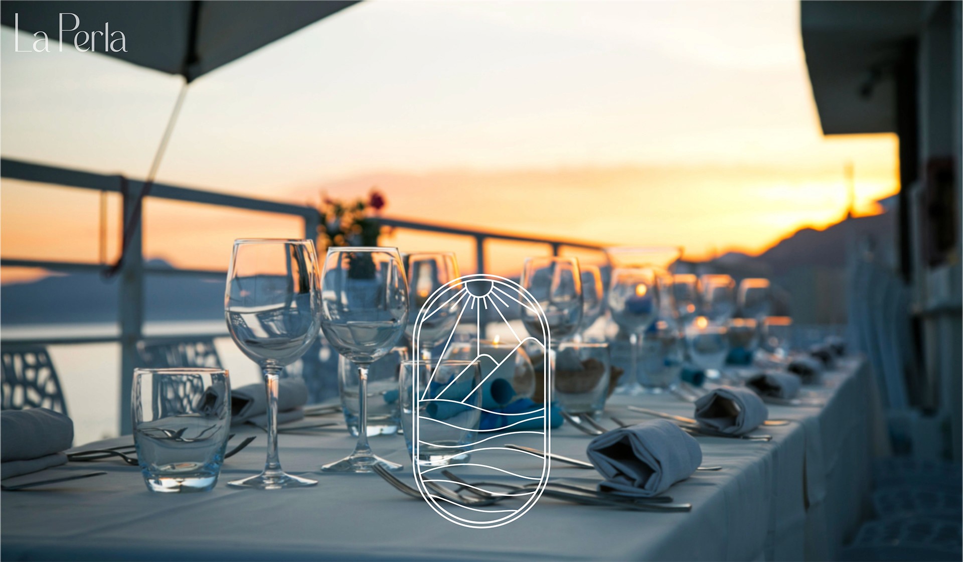
La Perla is a branding project created for a Mediterranean restaurant with the goal of building a modern and elegant visual identity. The project focuses on creating a strong and recognizable image inspired by Mediterranean culture, combining simplicity, refinement, and a warm visual atmosphere. Through different branding elements and graphic applications, the project aims to reflect the restaurant’s identity and create a cohesive visual experience for its communication.
About the Project
The La Perla project was developed as a complete visual identity for a Mediterranean restaurant, focusing on creating a clean, elegant, and coherent branding system.
The project includes the design of the logo, typography selection, color palette, and various visual applications used across the restaurant’s communication materials.
Inspired by the Mediterranean atmosphere, the artistic direction combines modern design with refined visual elements to create a brand identity that feels authentic, welcoming, and premium.
The objective of the project was to build a recognizable and memorable image that represents the restaurant’s personality and dining experience.


Colors
The color palette and overall mood are built around warm, natural Mediterranean tones.
The dominant use of sandy beige, soft whites, terracotta, and muted earthy browns creates a calm, sun-drenched atmosphere.
These tones are often balanced with deep sea-inspired blues or subtle olive greens, reinforcing the coastal identity of a Mediterranean restaurant.
The overall mood is elegant but relaxed, aiming to communicate freshness, authenticity, and a premium dining experience without feeling overly formal.
The lighting and visual styling typically emphasize natural light, textures like stone and ceramic, and a handcrafted aesthetic that evokes coastal living and Mediterranean warmth.
Typography
The typography follows a refined and editorial approach, usually combining a sophisticated serif typeface for the main brand name with a clean sans-serif for supporting text.
The serif choice gives the identity a timeless, high-end restaurant feel, while the sans-serif ensures clarity and modern readability across menus and applications.
The spacing is often generous, with careful kerning and alignment to reinforce a sense of luxury and breathing room. Overall, the typography works as a subtle but important extension of the brand positioning: elegant, minimal, and rooted in Mediterranean sophistication.


